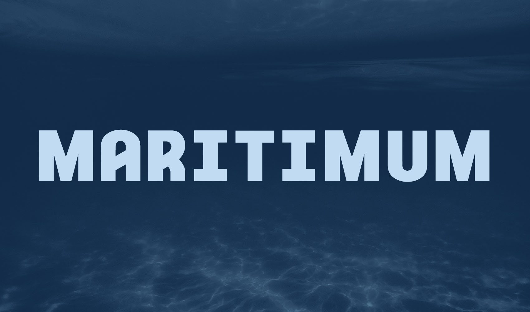
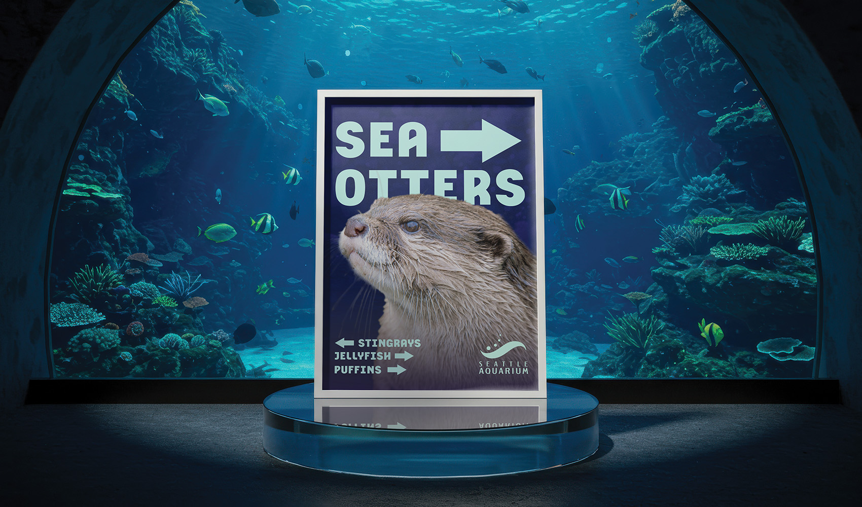
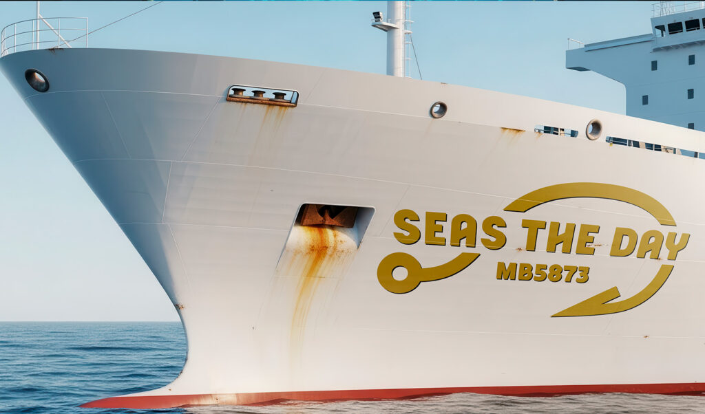
Maritimum is a bold sans-serif display, intended for use in signage, magazines, posters, packaging, and other print materials. It is best used at large sizes, from 20pts to 300pts and is primarily meant to be used by designers.
Maritimum draws inspiration from the sea, specifically nautical signage and boat sidings. Meant to be practical, yet charming, Maritimum uses clean lines, bold strokes, angled crossbars, and unique curves.
Process
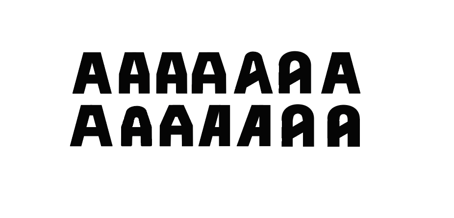
The creation of Maritimum was a methodical process, beginning with the examination of various sans serif typefaces and the exploration of different stylistic directions.
Maritimum began with the letters H, O, and D. These letters first established the bold and practical stylization of the typeface, while the angled crossbar on the H established its charm and uniqueness.
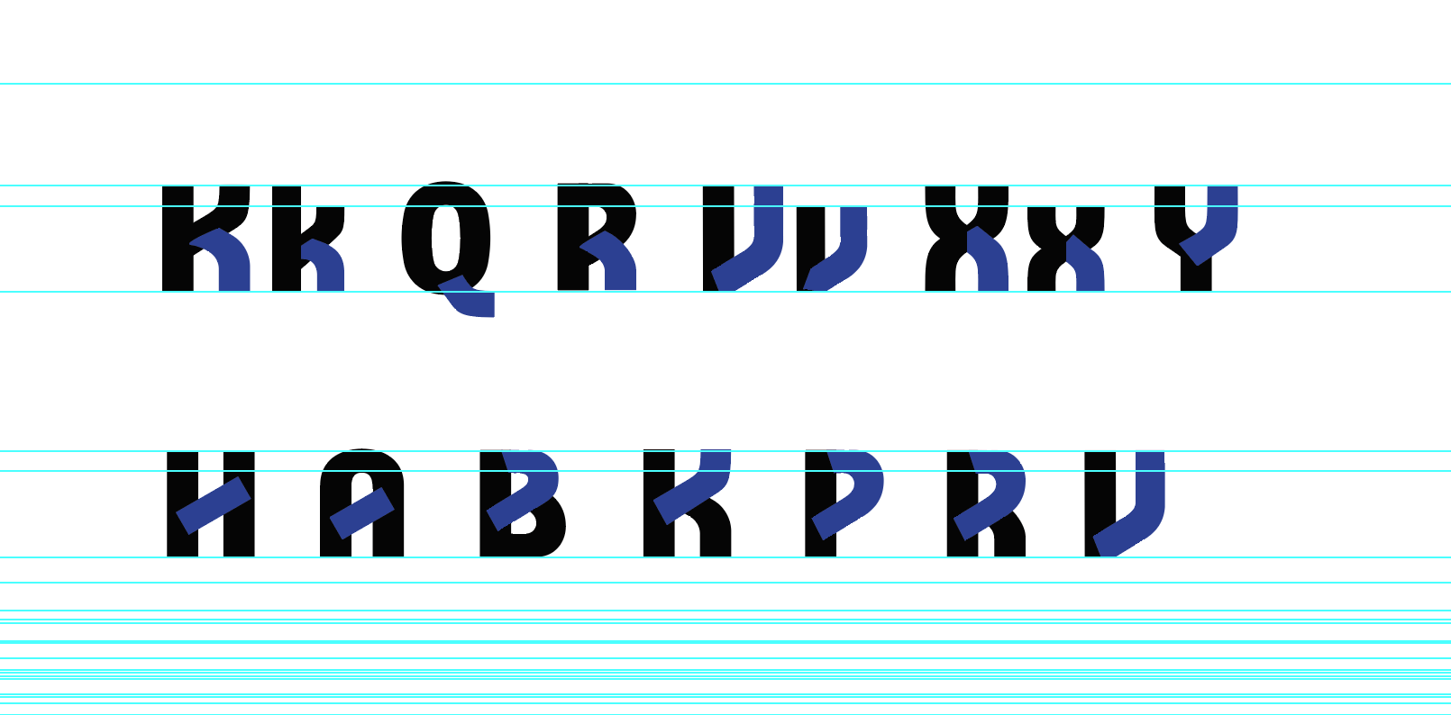
From there the rest of the uppercase and lowercase glyphs were developed, each with numerous iterations ranging from large changes, to minor adjustments. Whenever possible elements from other glyphs were utilized to build new ones, for instance the curve of the K’s leg was adapted for use in the Q, R, V, v, X, x, and Y.
Final Result
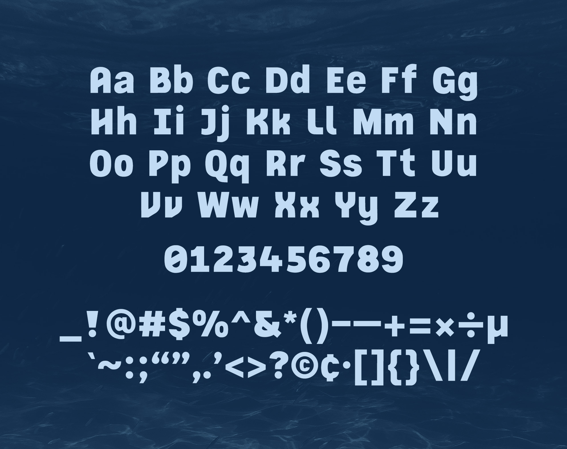
The final result of Maritimum is a clean, versatile, and bold typeface, excellent for use in headlines and print applications.
Test it out with the font tester below and give it a download!